

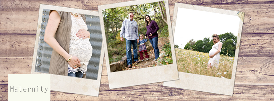
Here is a collage I created for Mr. E’s room… His mom told me that she thought these images would make a cute collage for his room, so once she described his room to me, I whipped this up.
What do you think? Should I make any changes? How about the background color? Which one do you prefer?


Oh and this is sized as a 16×20, but can also be printed as an 8×10. It will be mounted on 2mm styrene and coated for protection. Then you can frame it or just use a plate rack or easel for displaying it!
Okay… After some of the comments confirming that this collage ‘might need something’, I added a little border and feature that makes the images look even more vintage… It’s called TTV – ‘through the viewfinder’. It’s supposed to give it that look of being taken with an old camera. WDYT??

I love the red one the best!
my question would first be to them, what are the colors of the walls in the child’s room?
But without knowing that, my first pick would probably be the khaki color background.
Actually, all 3 colors are in his room. 😉
Khaki was my favorite too! Kev liked it with a little more color though…
All the pictures are not big enough to see all the details, but what a great idea. I love the starts on it. I think it really depends on the room colors. The stars pop out better on the khaki one, but the whole project doesn’t pop as much without color.
My vote is for the red background. 2nd place would be tan background. However, I almost think the tan doesn’t make the pictures stand out enough from the background. Just my 2 cents! You may’ve already tried this, but how about some type of inner our outer glow on each photo box to highlight it a little more? Sometimes that helps. Cute cute!